Iskander Amyatt-Leir
︎ About
︎ Contact
︎ PDF Portfolio
︎ CV
︎ IMDB
Rebranding Fringe!
BRANDING | TYPOGRAPHY | QUEER
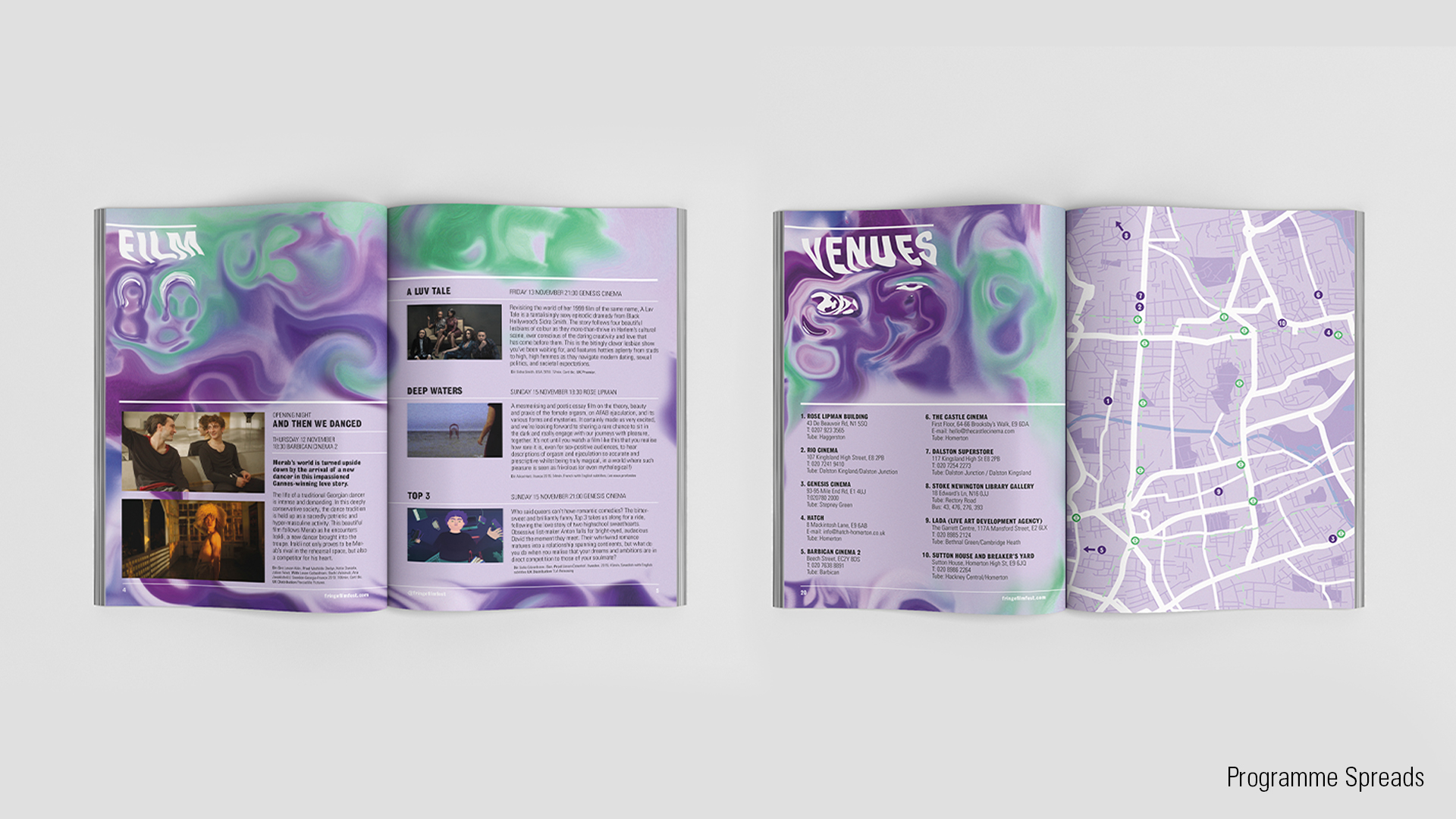
Fringe! is a queer film and arts festival showcasing a diverse, inclusive and provocative range of queer produced visual arts. While the festival has expanded over the years the main ethos remains the same: creating an accessible, affordable and inter-sectional space. The festival is constantly looking at ways to include new voices and ideas.
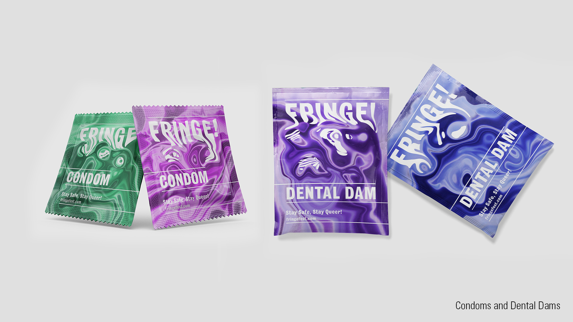
Instead of one logo there is a distinctive typographic treatment to the festival’s name, Fringe! representing the fluid and ever changing nature of gender, sexuality and the queer community.
x
The branding is androgynous without ignoring male and female identities. Lavender is historically linked to the queer community, with purple representing a mix of male and female in queer pride flags and green the non-binary identities. Pink and blue are used equally to avoid gender connotations.


︎︎︎ Previous Next ︎︎︎