Iskander Amyatt-Leir
︎ About
︎ Contact
︎ PDF Portfolio
︎ CV
︎ IMDB
Time Rationing
TYPOGRAPHY | RISOGRAPH | EPHEMERAL
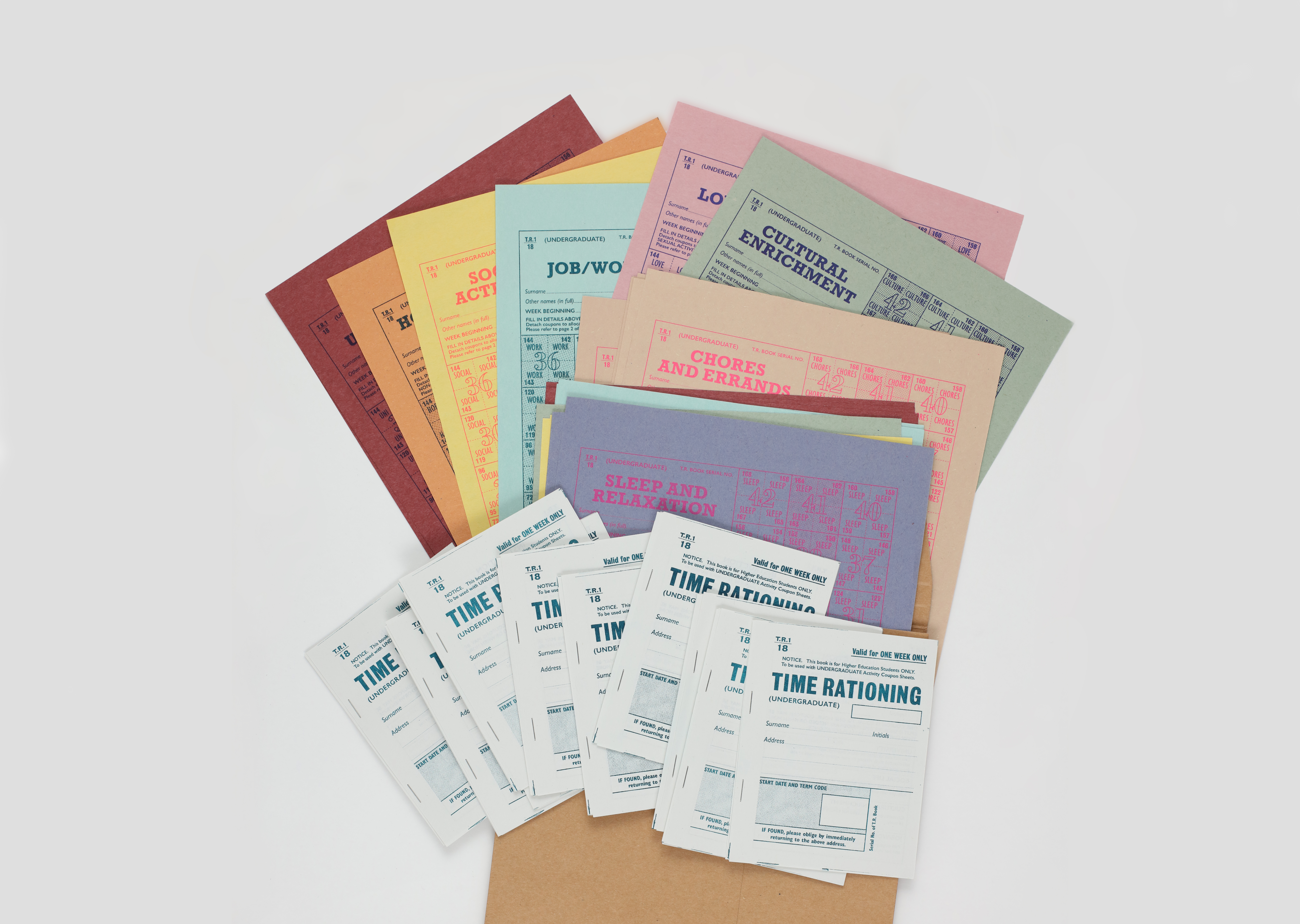
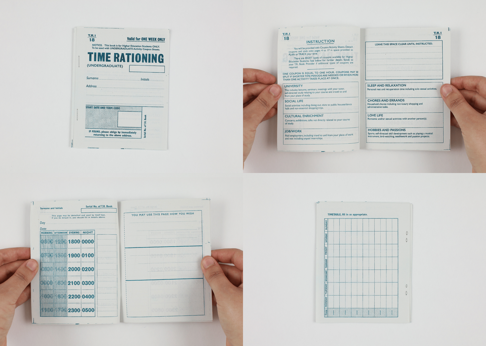
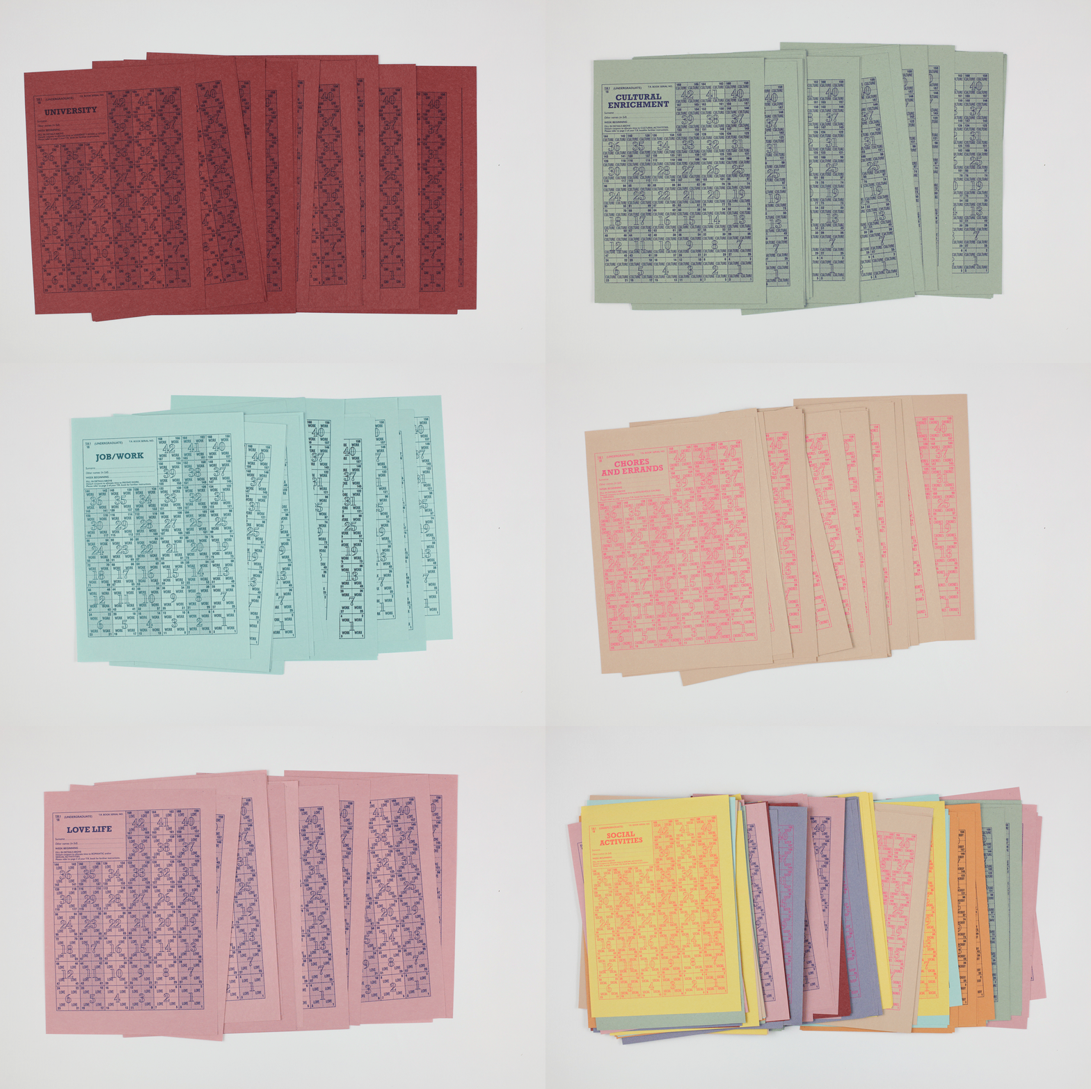
The brief was to explore a typographic system and repurpose or ‘hack’ it to support some form of social change. I decided to work with second world war ration books, which I have a collection of, and looked at what is hard to come by today. My peers and fellow art students were unanimous. It’s time that is always in short supply.
x
I wanted to reproduce the typographic style of a ration book accurately - which was a challenge because it was the errors which made them look authentic. To emulate the design of ration books I needed to go against the rules of modernist design, such as using multiple typefaces, uneven layout, poor kerning, and a lack of consistency. The same was true of the printing and I used risograph which added the texture that is missing from the crispness of a digital print.


︎︎︎ Previous Next ︎︎︎